Context & challenge
Shakepay was originally designed as a crypto exchange—purpose-built for trading, but not for scale. As the company matured, it became clear that the product ecosystem couldn’t support broader financial services without a fundamental shift.
Key limitations included
Lack of information hierarchy, making it hard for users to discover or understand new features.
Unscalable UI architecture, with no space to introduce new services without adding clutter.
A narrow user perception, reinforcing the idea that Shakepay was a single-purpose tool rather than a comprehensive financial platform.
We also recognized a trade-off
Shifting toward a money app wouldn’t resonate with every existing user. Still, the vision was clear. Expanding into financial services would increase customer inflows and deepen engagement through a multi-product strategy.
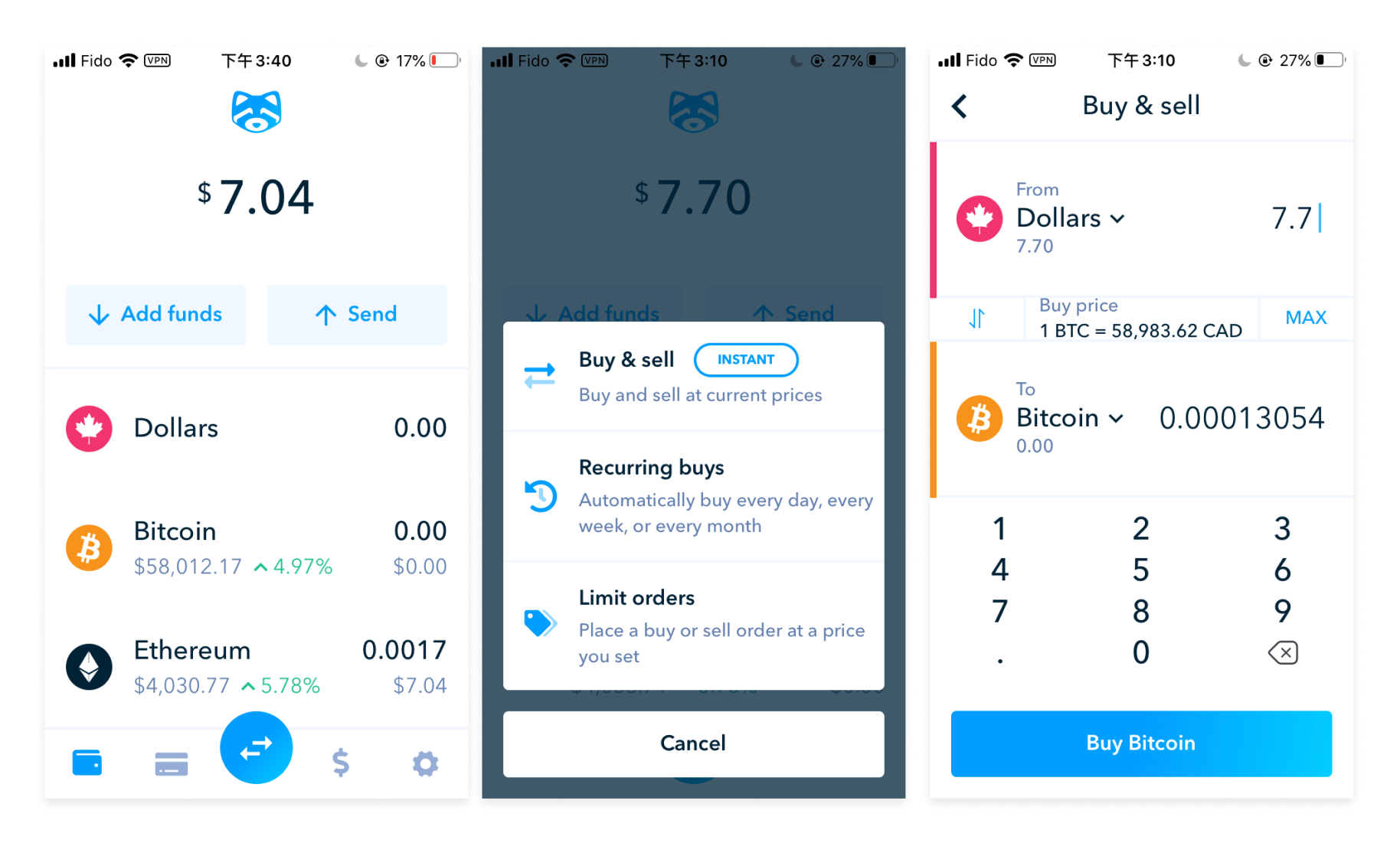
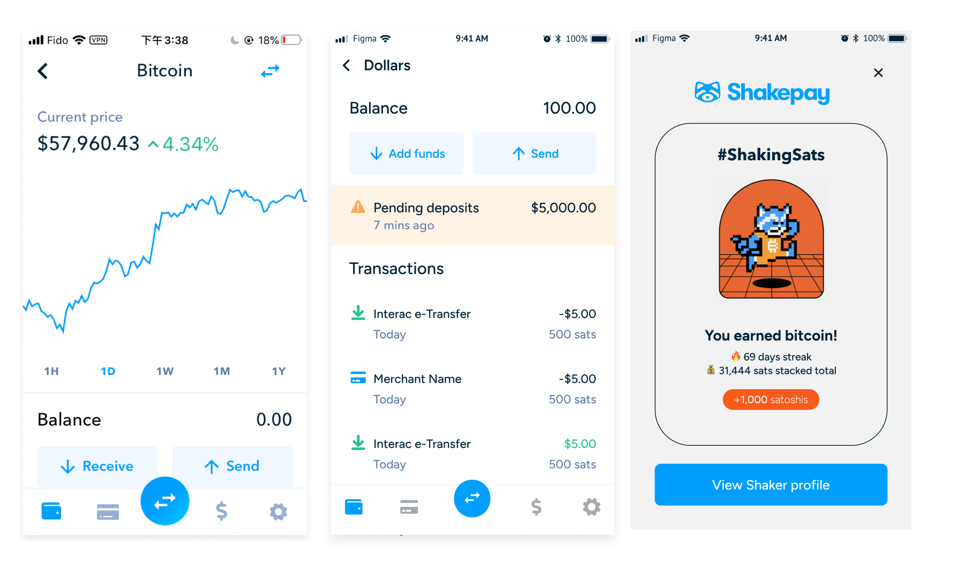
To enable Shakepay’s evolution from exchange to money app, we led a full redesign and repositioning effort focused on architecture, hierarchy, and experience.
1. Re-architected the app for growth
Introduced a modular, card-based dashboard to support new products like savings, cards, and rewards.Created clearly defined product spaces to support discoverability and future growth.
2. Modernized the UI foundation
Applied a clean, scalable design system with improved typography, iconography, and spacing.
Reduced friction with a more intuitive layout, improving readability and cognitive flow.
3. Repositioned Shakepay as a inancial Ecosystem
Crafted flows and in-app messaging to frame Shakepay as a holistic money management app.
Introduced contextual entry points for users to explore products at the right time, not just all at once